
Share this
by Luis Gonçalves on Jan 13, 2024 6:09:44 AM

The "burndown chart," a visual representation of work completed versus work remaining over time, becomes a pivotal tool in a project-to-product transformation, especially within the context of the ADAPT Methodology®.
As organizations shift towards a product-led approach, the way progress is tracked and visualized must evolve to encapsulate not just the development phase but the entire product lifecycle.
The burndown chart, in this transformation, serves as a transparent, straightforward tool that not only tracks the team's progress but also forecasts potential roadblocks, ensuring that the development is aligned with the product strategy and customer needs.

It facilitates a continuous, iterative development approach, which is crucial in maintaining agility and flexibility - key tenets of the Agility pillar in the ADAPT framework.
Thus, the burndown chart becomes an essential instrument in navigating the nuanced path from project-centric to product-oriented organizations, ensuring alignment, foresight, and adaptability in the development process.
As your company shifts focus, from delivering isolated projects to nurturing and evolving comprehensive products, you're going to need new methods to track progress, anticipate potential roadblocks, and adapt to changes. This is where the Burndown Chart comes into play.
Burndown chart is a common and useful tool usually used in stand-up meetings (not only) to assess how much work has been completed on an assignment. I personally like to use it as a forecasting tool instead. It gives us a rough idea of how we are doing in the current Sprint.
The simple, visually appealing format is used by many Scrum practitioners because it can be easily understood by all team members.
The Scrum Methodology is a mandatory framework for any leader that is serious about building a Digital Product Company.
Society changed and leaders need support in the way how they lead and design their digital product organizations, that is the reason why the ADAPT Methodology® was created, but now let’s get a deep dive into the Burndown chart topic.
Burndown charts are used to measure how much work has been completed on a project during a specific timeframe, then compared to the amount of time still available to complete the project. They outline the amount of work planned versus what is performed during each iteration.
The charts are a highly useful tool used to monitor completed work and work that still needs to be done during designated time frames. However, as useful as they are, burndown charts have their limitations. They cannot, for example, clearly or effectively measure work that is still in progress; they only measure what has already been completed.
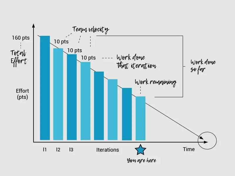
Below is an example of a burndown chart. It demonstrates an example of work completed versus work that can be delivered during each iteration.
 Originally taken from: http://www.agilenutshell.com/burndown
You can see by looking at the graph that the left side shows the total effort while the right side shows team velocity. This graph also provides the following information:
- Work completed during each iteration
- Work still needed to be done
- The timeframe when the team expects the project to be complete
While this chart is very clear and easy to follow, it’s not necessarily realistic. A true burndown chart will not have straight lines showing timeframes because the team will never complete their tasks at the same speed or in the same timeframe.
Pros and Cons of Burndown Charts
Burndown charts are highly effective tools with many strengths. However, there are weaknesses, or cons as well to using the chart.
Pros of using a burndown chart are:
- Burndown charts are simple, easy-to-follow representations
- They clearly show an Agile team’s achievements
- Clearly show what the team still needs to achieve
- Let teams know if they are on target with their deadlines.
- Alerts the team to potential problems or bottleneck situations quickly
- Show plateauing of a project
- Teams can see where they need to focus their efforts to get back on track.
- Motivate the team
- Show the team where they have succeeded and the work they still need to do
The cons of using a burndown chart include:
- They are limiting – the charts only show part of the total picture
- They do not show what tasks are still in progress
- They do not show how close the team is to complete their work.
- They can lead to exaggerated expectations
Teams that run aggressive projects based on unrealistic or over-inflated timeframes can become easily disgruntled, or lose their motivation when the project does not run smoothly. The team can also lose morale if they feel they are being micro-managed.
Any information that is not covered in the burnout chart should be addressed in a SCRUM meeting, so the team has a clear picture of how the project is going.
How to Create and Use a Burndown Chart
To effectively create and use a burndown chart, the team must first implement a task breakdown. This usually happens at the sprint planning meeting. Each task identified in the breakdown should have an allotted amount of time designated to complete the task. Ideally, 12 hours is the best amount of time. This can be broken down into two, six-hour days.
Once the task breakdown has been completed, the team can then create and plot their burndown chart. If the team assumes that each task will be completed at the same rate as the rest of the tasks, then their ideas should reflect their steady progress.
There are many Agile tools available with built-in burndown chart abilities. Some of these tools include Rally, RTC, Version One, and Mingle. If you do not have any of these programs, an Excel spreadsheet can be used to create a burndown chart. On the spreadsheet, input the sprint dates on the X-axis and the remaining efforts on the Y-axis.
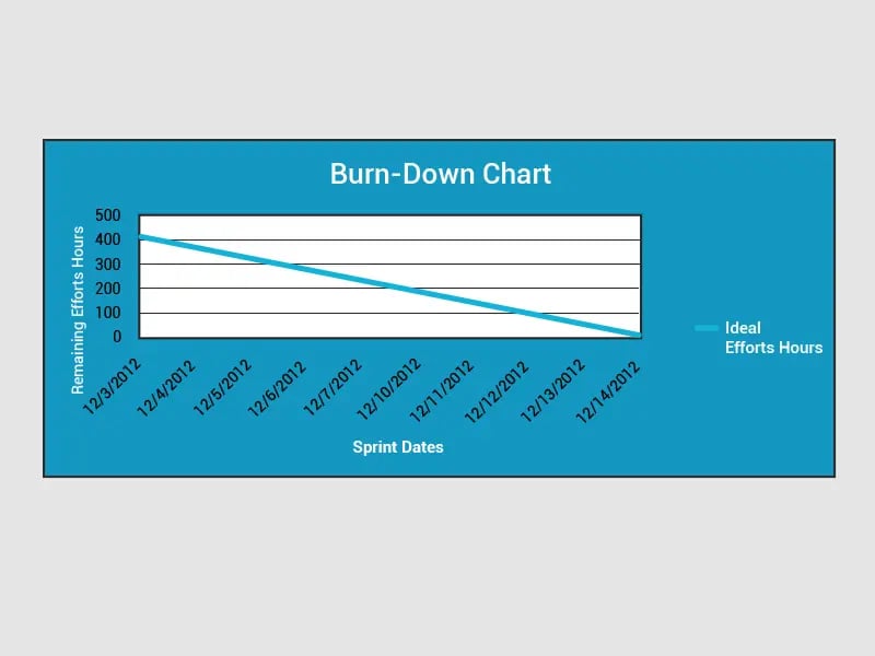
I’ve included an example of an ideal burndown chart below:
 Originally taken from https://www.scrumalliance.org/community/articles/2013/august/burn-down-chart-%E2%80%93-an-effective-planning-and-tracki
In this example, the sprint is 2 weeks; the team consists of seven members working 6 hours per day for a total of 420 hours. As you can see, the total hours for the entire sprint are show on the Y axis. The red line shows what the ideal work progress should be during the sprint. If we assume there will be no problems or delays, all the tasks should be finished by the end of the sprint.
The next example demonstrated another burndown to chart the team’s progress during the sprint:
 Originally taken from https://www.scrumalliance.org/community/articles/2013/august/burn-down-chart-%E2%80%93-an-effective-planning-and-tracki
You can see that the red line shows the progress that has been completed while the blue line shows the remaining effort needed to complete the project.
Release Burndown Charts
Scrum projects can use release burndown charts to track their progress. The Scrum Master is responsible for updating the release burndown at the end of each sprint exercise. On this chart, the horizontal axis shows each sprint while the remaining work is shown on the vertical axis.
Teams can use any method they choose to show the remaining amount of work including story points, team days, and ideal days.
An example of a release burndown chart can be seen below:

In this example, the chart shows that the team started with 360 story points. To successfully complete their project in their planned six sprints, the team would have to average 60 story points for each sprint.
This example also shows that in the first sprint, the team used 90 story points with 270 remaining. The second sprint ran smoothly as well. However, as you can see in the chart, something happened during the third sprint and the team burned up their story points. Once they resolved the issues in the third sprint, the project ran smoothly for the remaining sprints.
There are a few reasons why teams can burn up their story points including adding extra work to the project, making changes to the timeframe, or adjusting work estimates. Once these issues are re-evaluated, the project should run smoothly again.
Release burndown charts are popular with many teams because they work well in a variety of situations. However, they do not work well on projects where lots of changes occur. These projects work best using an alternative form of the release burndown chart.
Common Errors That Create Misleading Information in Burndown Charts
These common errors made by agile teams can cause misleading information on the burndown charts:
Multiple stories with a common function
There are some projects where teams have multiple stories but only one generic function. Burndown charts can be misleading in these circumstances because adding extra tasks will give the wrong number of total hours. Tracking the progress with incorrect times is also misleading.
Too Big or Too Detailed Tasks
If there are too many tasks created in a project, it becomes too difficult for the team to accurately track them. Tasks should be small enough that they can be completed within 12 hours. Big tasks cannot be assessed properly during a daily timeframe; teams cannot assess how much work remains.
Effort Remaining and Effort Spent are Misunderstood
This is one of the most common errors made by teams. To avoid making this error, teams should re-estimate their tasks at the end of each day and update how much time is needed to complete the task.
Lack of Discipline in Updating Charts
Teams must update the ‘effort remaining’ measurements on their burndown charts every day. If teams lag in this task, their burndown chart might not be accurate.
Burndown vs Burnup Charting
There are two different charts used to measure time on a Scrum project: burndown and burn up. Burndown charts measure how much work remains on a project. Burnup charts, on the other hand, measure the amount of work that has already been completed and the total amount of work that has been done.
Teams will have an easier time deciding which chart to use for their project if they first look at their project goal. For example, if their aim is to keep the project alive by presenting information to a client, or the Scrum Master is trying to motivate the team, a burnup chart would be the better option. But if the Scrum Master wants to gain greater knowledge or understanding of what is occurring in the project, the burndown chart is the better choice.
Information vs Simplicity
Another difference between burndown and burnup charts is one is simplistic while the other provides information. Burndown charts are simple: one line heads towards the zero mark as the team completes the project. They are easily understood by everyone on the team and do not require a lengthy explanation. However, burndown charts do not tell the whole story. They often conceal certain information like the effects of scope change.
Scope changes occur whenever work is added to or removed from a project. All Agile practitioners and team members should be familiar with scope change. It occurs when clients add extra features to the project or remove tasks so the project can be completed on time. A burndown chart cannot show these changes, but a burnup chart can.
Burnup charts use two separate grid lines to track the work that has been completed and the total amount of work already done. The total work done line can provide vital information to the team about why the project is not finished. Some reasons might include: work is too slow; too many new tasks were added to the project, or there are other problems within the project.
Burnup Charts and Regular Progress Meetings
For Scrum Masters who meet regularly with their team or customers, burnup charts are the better choice to use at the meeting. It’s easier to show the team’s weekly progress with a burnup chart. This type of chart will also show the group any testing or problems that have added more work during the week.
Scope Creep
Scope creeps are not beneficial to software projects. They are the uncontrolled changes or growth to a project. When scope creeps are affecting the project, the burndown charts show little work done. It can be very deceiving. However, burnup charts will clearly expose the scope creep in a project. While scope creeps are damaging to a project and every team’s nightmare, they can also be beneficial. When a scope creep is exposed, the team can use it to convince customers to stop changing or adding work to the project.
Fixed Scope Projects
A fixed-scope project has a completion date for achieving all story points. Defined fixed scopes only happen under limited situations. For projects with fixed scope deadlines, burnup charts are not useful because they do not provide more information than the burndown charts.
Using Burndown Charts in Daily Stand-up and Sprint Retrospectives
Scrum Masters often use burndown charts and daily stand-ups as a self-organization tool with their team. The burndown charts provide a summary of the team’s work. It shows the master and members what work they have completed and what issues they face.
The information provided in the chart can be used as inputted data in a daily stand-up. If the team finds that they are lagging, there are things they can do to get back on track. They can:
- Address bottlenecks be reallocating work
- Solve issues
- Use the expertise of team members to speed up more challenging story points.
- Talk to the project owner to de-scope.
De-scoping should only be done as a last result. Every and all other possible solutions should be looked at first before taking this step.
The purpose of using a burndown chart in a daily stand-up is to get the team back on schedule again.
During the meetings, it’s important that the Scrum Master looks for different cues such as: how well the team is working together, who is the lead, the level of honesty; team collaboration from the member, and commitment to the project.
The burndown charts provide good input in sprint retrospective meetings because teams can see the changes and look at the information to find the real cause of any issue or delay. Through team discussions and brainstorming meetings, teams can analyze the information and find solutions.
Hours Remaining in Burndown Charts – Agile Anti-Patterns
Hours remaining burndown charts are great tools for tracking the amount of time remaining on each task. They are easy to read and will quickly show the team if they are on time with completing their story points at the end of each sprint.
Yet, as effective, and easy as this chart is, many teams still face a very common problem: the information on the chart appears to deceive the team. While the charts show the team on target with each sprint, the reality is much different.
That is because we tend to buy into the myth “Plan the work, work the plan” to often without putting the effort in to complete the tasks. It’s easy to plan the project but to complete it, the team must put the work in.
How can you tell if this is happening to your team? Here are some signs to look for:
- Inefficiencies in the hours remaining metrics
- Root cause analysis uses the burndown chart to reveal any issues
- Team members want to toss the burndown chart completely
What Can You Do?
To stop this from happening in your team, it’s important to focus on the primary directive. Use software that can complete burndown charts in the sprint. Focus on the finished stories as the primary metric. Add a completed burndown chart to help regain your team’s focus.
Hours remaining burndown charts should never be discarded because they are valuable tools that can help a team organize the work that still needs to be done. You can use these tools to keep your team focused on the present situation with the project; not on past myths or false hopes.
Did you like this article?
We enable leaders to become highly valued and recognized to make an impact on the World by helping them to design Digital Product Companies that will thrive and nourish in the Digital Age, we do this by applying our own ADAPT Methodology®.

Share this

Organisational Mastery
Get your free copy
ADAPT
Get your free copy

Product First
Get your free copy